
Project Details
Naveen Portfolio web Design
- Client: SLSN IT Services
- Industry: Digital Marketing & SEO Services
- Role: UI/UX Designer
- Tools: Figma, Adobe photoshop, WordPress
Project Overview
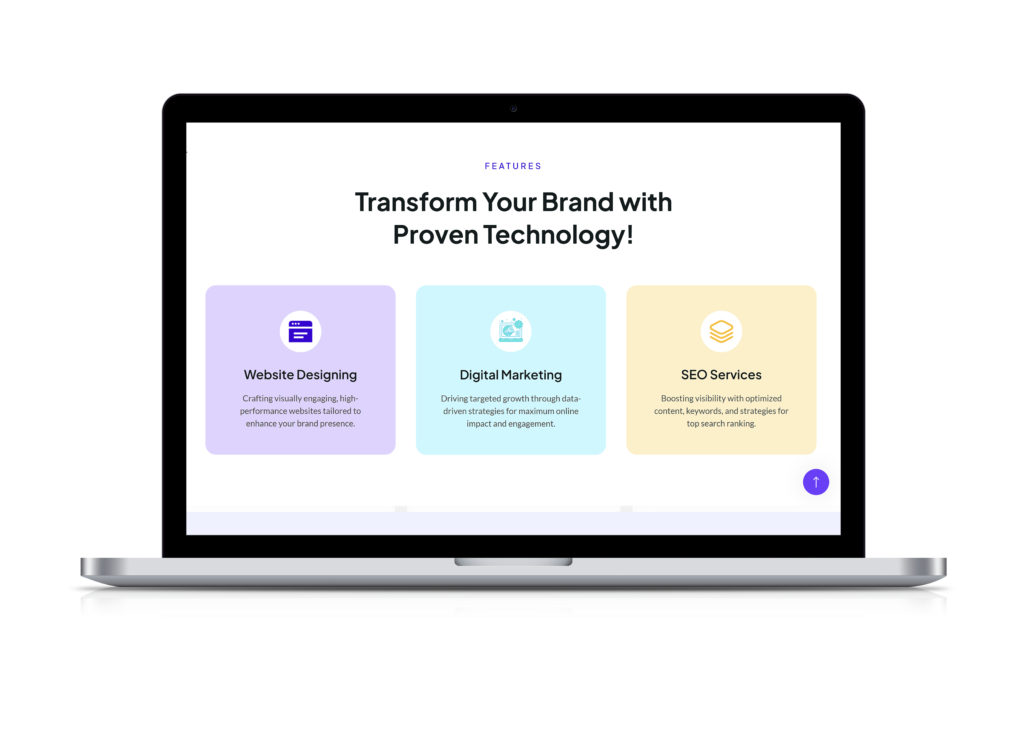
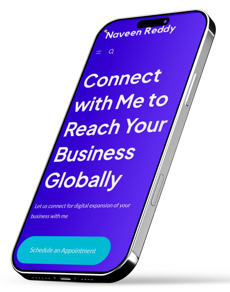
The goal was to design a professional and engaging website that showcases Gade Naveen Reddy’s expertise in digital marketing, SEO, web design, and advertising solutions. The site features a clean UI, intuitive navigation, and a structured content layout, ensuring seamless user experience. A strategic color palette and typography enhance readability and brand identity. Key focus areas included service clarity, lead generation, and mobile responsiveness. By addressing usability challenges and optimizing engagement points, we created a visually appealing, user-friendly platform that effectively communicates his services while making client interactions effortless.
Colours
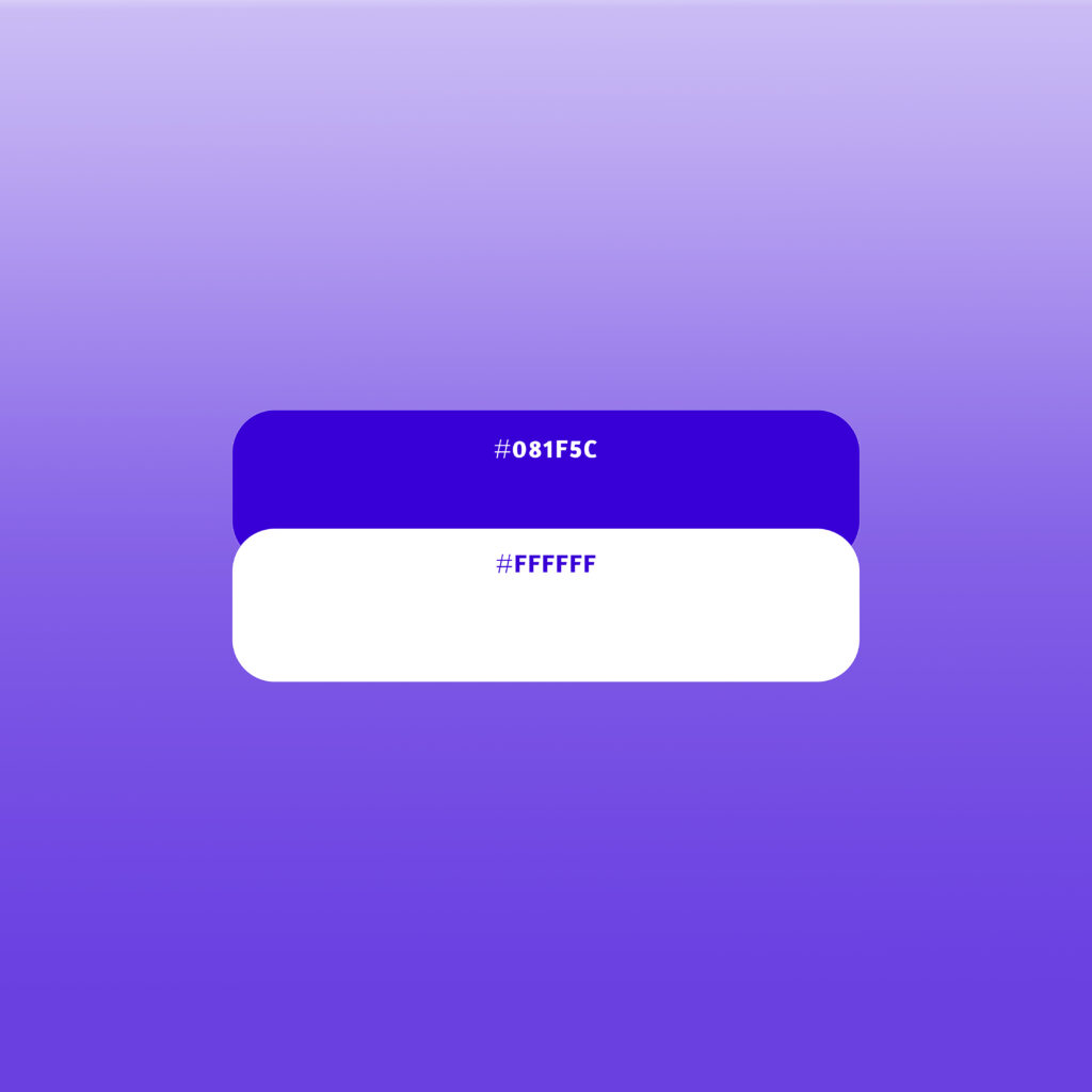
The color palette was carefully chosen to establish a sense of trust, professionalism, and modernity. The deep blue (#081F5C) represents expertise, stability, and reliability, making it an ideal choice for a personal brand in the digital marketing and technology sector. Blue is known for its ability to instill confidence in users, ensuring that visitors perceive the brand as authoritative and credible. To maintain clarity and enhance readability, white (#FFFFFF) is used strategically as a background and text color. White symbolizes simplicity, transparency, and minimalism, helping to create a clean and distraction-free user experience. The combination ensures that important information stands out while maintaining an elegant and modern feel. The gradient effect in the background adds depth and visual appeal, subtly guiding the user's attention through the interface. This blend of colors ensures an engaging, intuitive, and visually harmonious experience that enhances usability while reinforcing the brand’s identity.
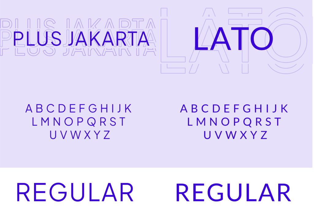
Typography
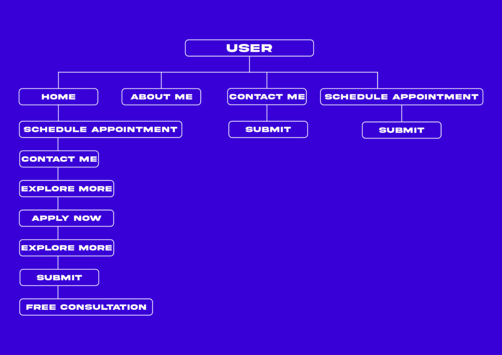
Site Map
Requirements
A professional and trustworthy website to establish a strong digital presence. A well-structured sitemap for seamless navigation and improved user experience. A visually appealing and engaging interface that aligns with the brand identity. Strong readability and accessibility to cater to a diverse audience. Strategic CTAs to drive user engagement and conversions.
Provisions
Designed a clean, intuitive layout ensuring ease of navigation and content discoverability. Implemented a balanced color scheme to reflect credibility, approachability, and clarity. Used typography principles to enhance readability and visual hierarchy. Developed a fully responsive website, ensuring seamless access across devices. Optimized content structure and CTAs to encourage user interaction and engagement