
Case Studies
Netflix UX Law Playbook
Case Study Overview
Netflix isn’t just about streaming—it’s about seamless engagement. In this case study, I explored how Netflix applies key UX laws to create an intuitive and user-friendly experience. From Fitts’s Law (making important actions easily accessible) to Hick’s Law (simplifying choices for faster decision-making), every design element is carefully crafted to enhance usability. Through heuristic analysis and behavioral research, I uncovered how Netflix blends AI-driven personalization with smart UX principles to optimize user engagement. Whether it’s the placement of the “Play” button, content categorization, or visually appealing layouts, each feature is designed to keep users immersed. This case study deepened my understanding of human-centered design, reaffirming my passion for AI-powered UX solutions that adapt to user behavior in real time.
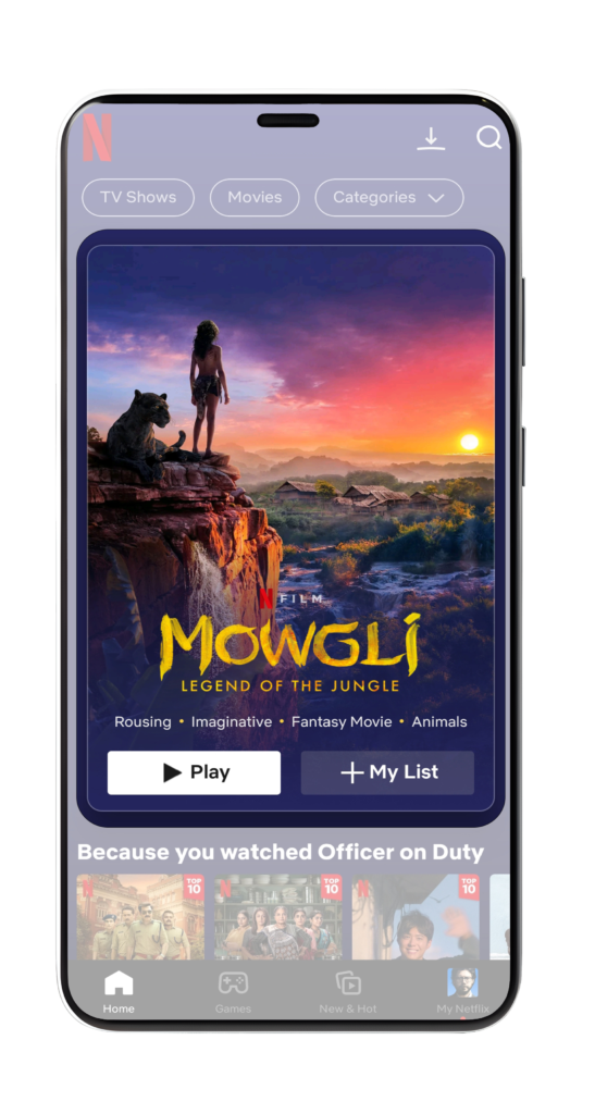
Fitts’s Law!
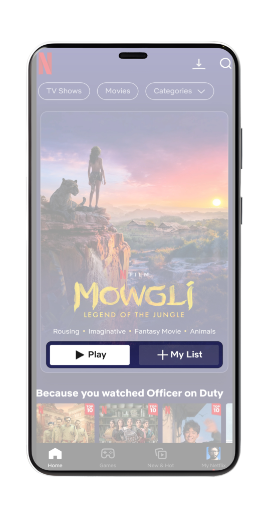
Ever wondered why Netflix’s “Play” button is big and easy to reach? That’s Fitts’s Law in action!
By placing key controls like “Play,” “Pause,” and “Add to My List” in prominent, easy-to-tap areas, Netflix reduces the effort needed to interact with content. The larger the button and the closer it is, the faster and easier it is to use.
Less effort, more bingeing!
With intuitive placement and sizing, Netflix keeps you immersed in entertainment without a second thought!
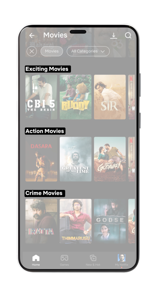
Hick’s Law:
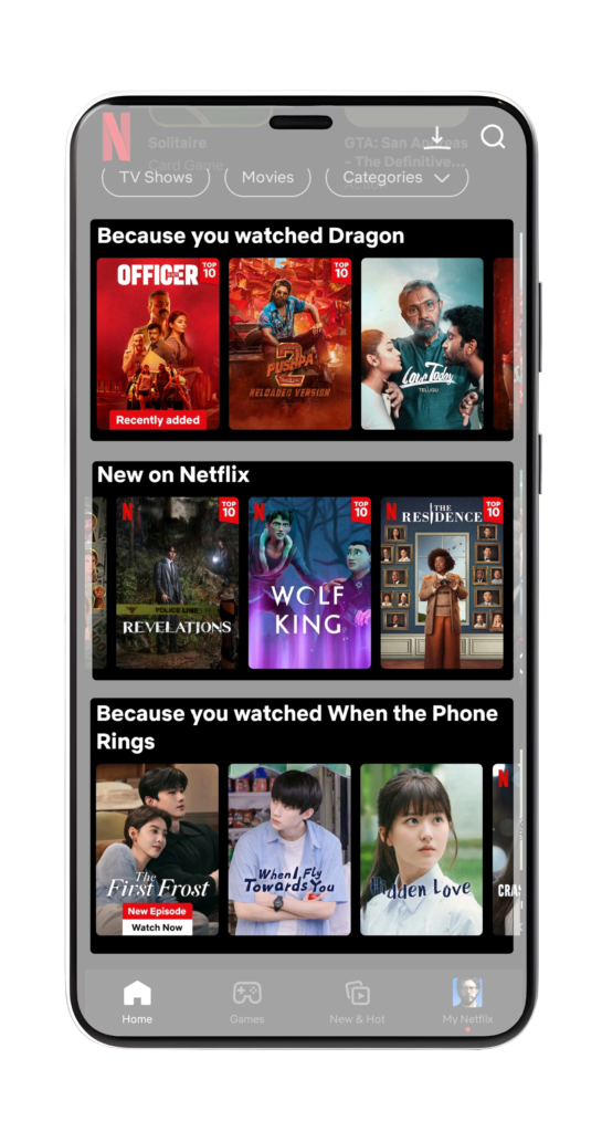
Ever felt overwhelmed by too many choices? That’s Hick’s Law in action! The more options you have, the longer it takes to decide. Netflix tackles this by organizing content into clear, easy-to-scan categories like "New on Netflix", "Top Picks for You", and "Top 10 Shows in India Today". By reducing decision fatigue, Netflix ensures you spend less time scrolling and more time enjoying your favorite shows. Fewer choices = Faster decisions = Better experience!
Jacob’s Law
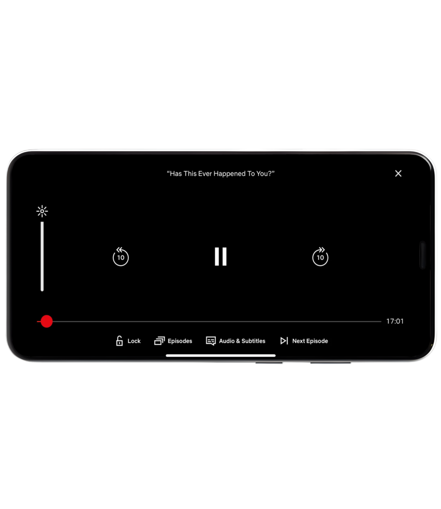
Ever noticed how Netflix’s player controls feel just right? That’s because of Jacob’s Law—users expect your site to work like the ones they already know. Netflix mirrors familiar design patterns found in other streaming platforms, like play/pause buttons, skip controls, and progress bars. This ensures a seamless experience, reducing the learning curve and making navigation effortless. Consistency = Better usability = Happy users!
Law of Proximity
Ever wonder why Netflix's interface feels so intuitive? That’s the Law of Proximity at work! Netflix groups related content together—whether it’s based on genres, themes, or user-specific recommendations. This makes it easier for users to scan, identify, and choose content they’re likely to enjoy. Less searching, more watching!
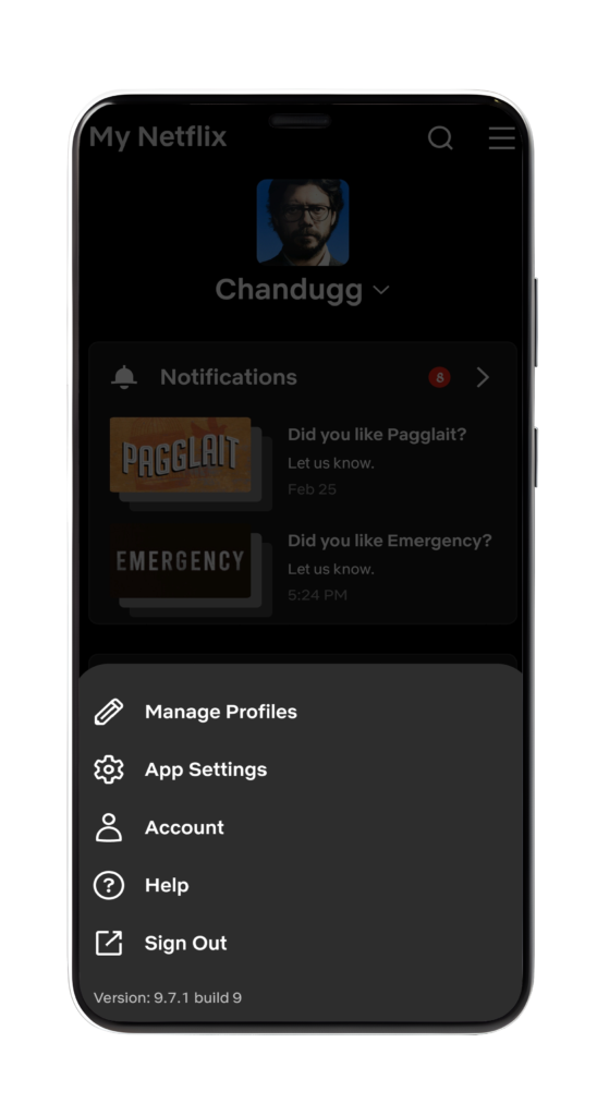
Miller’s Law
Did you know the human brain can only hold 7 ± 2 items in short-term memory? That’s why Netflix keeps it simple! Instead of overloading users with too many choices at once, Netflix: Limits visible options (e.g., profile settings menu) Uses progressive disclosure to reveal more content as users explore Less clutter, better decision-making!
Von Restorff Effect
Also called the Isolation Effect, this principle states that unique elements among similar ones are more memorable. Netflix leverages this by: Highlighting featured/new content with larger thumbnails Using bright colors and bold designs to grab attention This makes sure users notice and remember key content effortlessly!
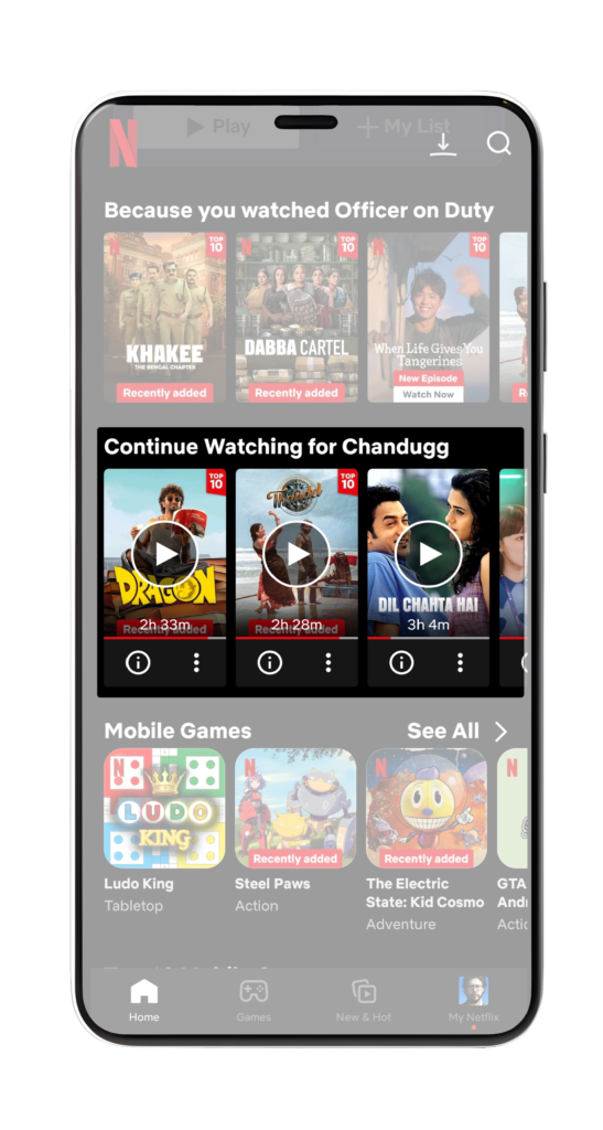
Zeigarnik Effect
Zeigarnik Effect! This principle states that people remember incomplete tasks better than completed ones. How Netflix applies this: "Continue Watching" keeps unfinished content visible & accessible Triggers curiosity and encourages users to return to complete what they started A brilliant way to boost engagement & retention effortlessly!
Conclusion
Netflix’s UX design smartly uses psychological principles to make the experience smooth and engaging. By keeping things simple, it avoids overwhelming users while making it easy to navigate. Highlighting featured content naturally draws attention, helping users discover new shows effortlessly. It also subtly reminds users of what they were watching, encouraging them to pick up where they left off. These small but powerful design choices create a personalized and addictive experience, keeping users coming back for more.