
Project Details
Ritz Infotech Web Design
- Client: Ritz infotech Group
- Industry: US IT Recruitment consultancy
- Role: UI/UX Designer
- Tools: Figma, Adobe photoshop, WordPress
Project Overview
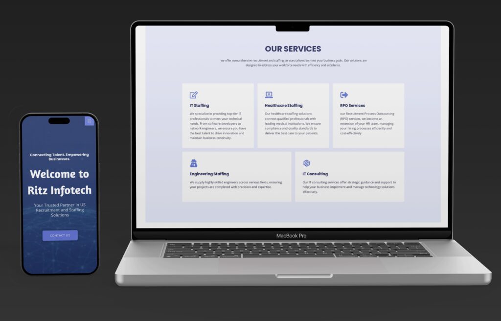
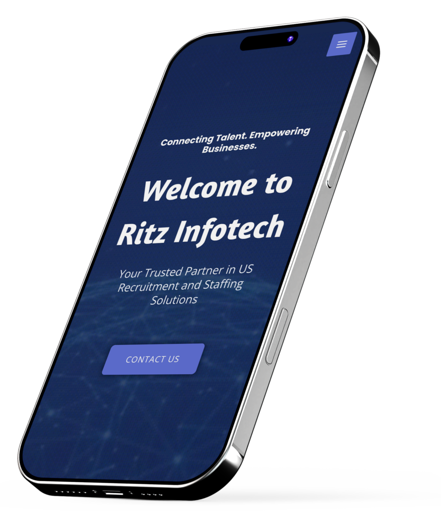
Ritz Infotech, a staffing and consulting firm, needed a website that effectively communicates its services while ensuring a seamless user experience. Our approach began with user research to understand audience needs, followed by wireframing and prototyping to create an intuitive structure. We designed a clean, professional interface with a well-organized sitemap, accessible typography, and a strategic color scheme that enhances readability. By optimizing content flow, call-to-actions, and navigation, we crafted a website that is both visually engaging and conversion-driven, making it easy for users to explore services and connect with the brand effortlessly.
Colours
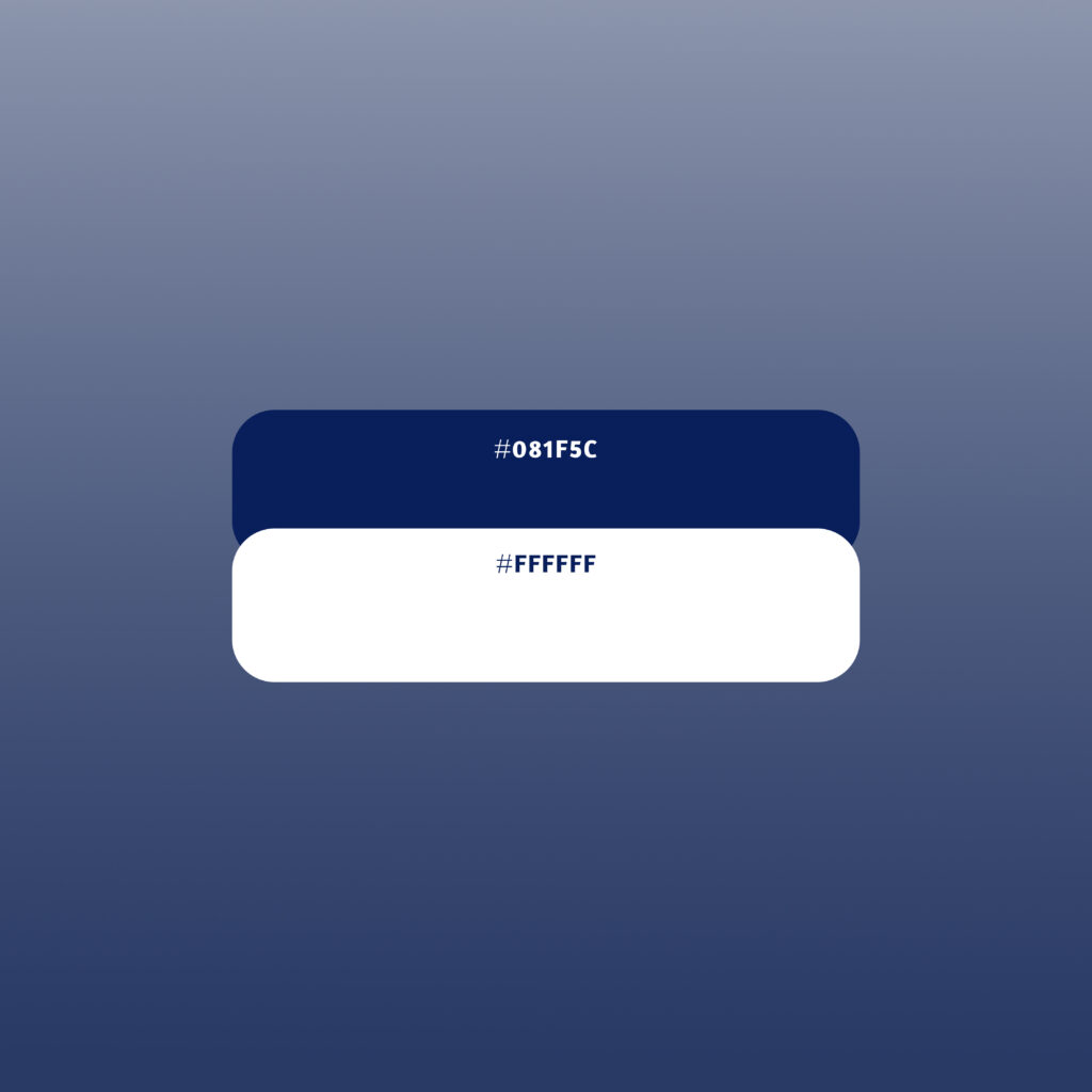
We chose deep navy blue (#081F5C) and white (#FFFFFF) to create a website that feels professional, trustworthy, and easy to navigate. As a staffing and consulting firm, Ritz Infotech needed a color palette that reflects expertise while keeping the user experience seamless and approachable. Deep navy blue represents stability, reliability, and confidence, making it an ideal choice for building trust with potential clients. It creates a strong visual foundation while maintaining a polished, corporate feel. In contrast, white brings clarity, simplicity, and openness to the design. It acts as a neutral space that enhances readability and ensures users can easily process information without visual clutter. This high-contrast combination improves accessibility, enhances content visibility, and creates a balanced, engaging experience. While blue establishes credibility, white keeps the interface light, modern, and welcoming—helping users navigate effortlessly and feel confident in Ritz Infotech’s services.
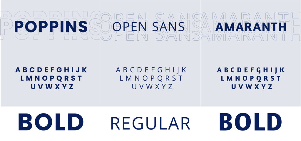
Typography
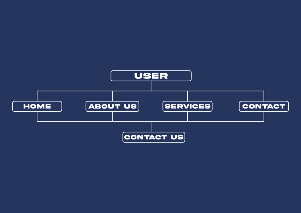
Site Map
Requirements
Clear Navigation – Ensure users can easily find information with a well-structured sitemap. Engaging Call-to-Actions – Drive user interactions with strategically placed CTAs. Readable & Accessible Design – Use typography and contrast that enhance readability for all users. Mobile Responsiveness – Optimize the website for a seamless experience across devices. Brand Consistency – Maintain a professional and cohesive visual identity.
Provisions
Intuitive Sitemap & Menu Structure – Simplified navigation for quick access to key services. High-Contrast, Action-Driven CTAs – Placed strategically to boost engagement and conversions. Accessible Typography & Clean Layout – Ensuring readability and user comfort. Fully Responsive Design – Optimized for mobile, tablet, and desktop experiences. Consistent Branding – A cohesive color scheme and UI elements that align with Ritz Infotech’s identity.